Cambridge Botanical Gardens.


British Museum in London


The Tate in Bankside, London


Postcards, Tickets, Receipts, Maps and Drawings.

Cambridge Botanical Gardens.
British Museum in London
The Tate in Bankside, London
Postcards, Tickets, Receipts, Maps and Drawings.


With so many things going on in that tiny space for a women’s club, I was worried that the club might get a crowded with the site given. Therefore, I wanted to see if I could play with materials to deceive the eye that it is a bigger space than it actually is.

This is a picture of a glass table and a notebook. I wanted to test out if it would look congested with the notebook there but it does not look like it because the glass is transparent. With the transparency, it confirms that the glass does indeed make the space appear bigger with adding much more into the room. It does not hinder the surrounding, making the surrounding clear without actually blocking anything or make it look tiny. The glass in this picture is tinted however, it does not change the fact that it still does not look like the glass is blocking anything or making it look tiny with the space taken up. With this experiment proving to be a success, I will use it on my designs when the time comes.
Colours must be well balanced and must go together. After all, they affect the mood of people and create a sort of ambience. This is why, I have put together a series of colours that should work well with each of the rooms I will make. The colours chosen were inspired by gender equality art as well as nature.

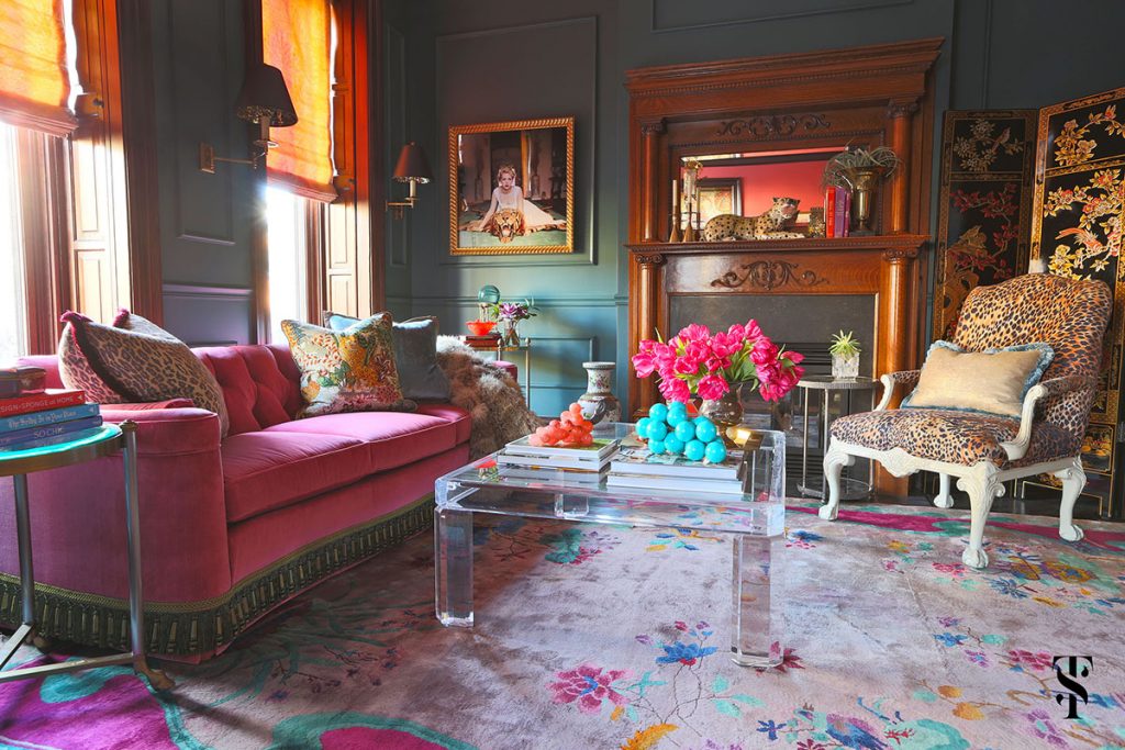
The colours selected here prove to be very feminine colours. Since the living room is a place of gathering and sharing, embracing themselves should be an important reminder for women. The colour pink is often frowned upon and classified as a colour which is too feminine, therefore, it is associated with being weak. However, it is just a social stigma that men have inflicted upon humanity. This ideology should be debunked and be shown that everyone can like the colour pink yet still be strong and powerful. The colours and tones of brown, black, yellow and grey are there to balance the pink colours so that it does not look monotoned and would give the rooms depth.

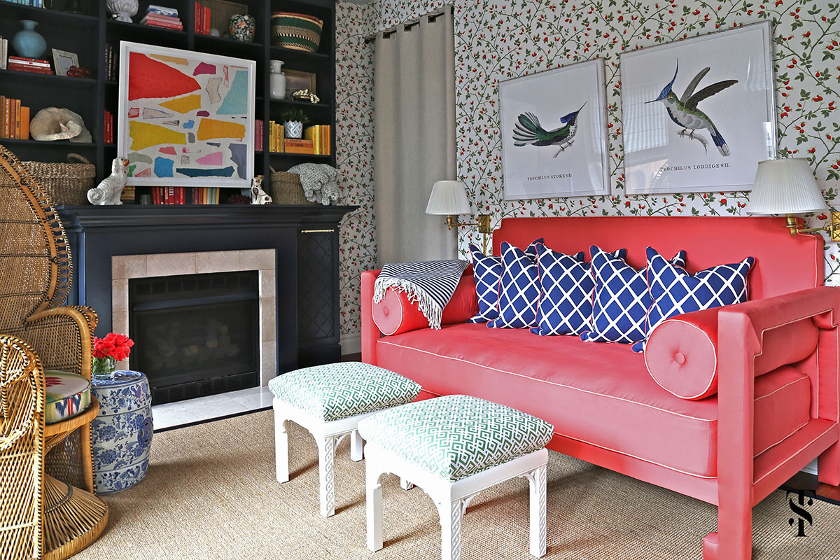
Colours for the library were inspired by nature; mostly from autumn. Autumn is a season where leaves fall and it gives people a peace of mind. This season calms people down as nature truly reveals itself. The colours of the leaves change and nature is getting ready for winter. There is a sense of beauty and calm in this. The weather is also not too hot nor cold. It would be the perfect weather for the temperature to not deeply affect anyone in a negative way as compared to summer or winter. The thought of autumn being the season where people reflect and deem it the best season to read books made me want to put the idea of autumn in a library. The surrounding should resemble being outdoors, surrounded by trees and fallen leaves. It should make them feel comfortable being surrounded by nature around them.

When the word toilet appears, all I can picture are dark, gloomy and smelly toilets. Toilets have been portrayed as a necessity in our day and age however, it is a pity that not a lot of design goes into improving the interior of these toilets. Instead of using the usual monotonous colour for toilets, I wanted the toilets to be something more than just a toilet. This is why I have incorporated a lot of colours into it. I chose these colours together because I wanted the toilets to resemble a luxurious bubble bath. Most toilets have the colours white and grey which looks too generic. Adding a hint of black adds sophistication and depth to the design. This can enhance the design of the toilet. With clean colours laid as the foundation, the other colours would complement the clean colours. Different tones of blue portray the different colours of the bubbles when they are hit under different angles of the light. When light reflects of a bubble, rainbow colours can be seen illuminating that. This is why I added pastel yellow and pink to the toilets because it portrays that without throwing the balance of the colours off.

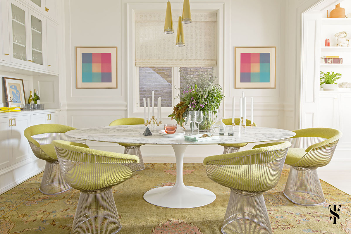
With the same thing in mind from the library, I wanted people to feel at peace when eating in autumn as that is when Thanksgiving happens however, I added the colour red to it because the colour red invokes hunger and a sense of urgency when people eat. Red is also a sexy colour which will make people good about themselves when they eat. Many women suffer from being judged from the way they dress to their weight. People may not realise but women are very self-conscious and emotional people. They will take it to heart and not feel good about themselves at the end of the day. With the colour red, it will help them bring the confidence they need to feel and be confident in the way they look, no matter their size or what they wear. They should be able to do what they want with their bodies because it is not anyone’s to take what is rightfully theirs.


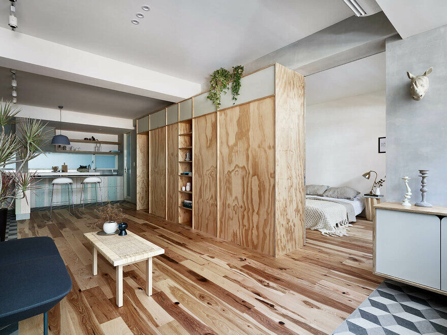
Liu and Tsao are owners of KC Design Studio. Together, they form a design team focusing on the interaction between human interaction with nature. With the incorporation of nature, it allows for a more a more minimalistic feel. The flow of each room must connect together. Nature is connected to everything. With that being said, the designs in each of the room must feel connected to be harmonious.
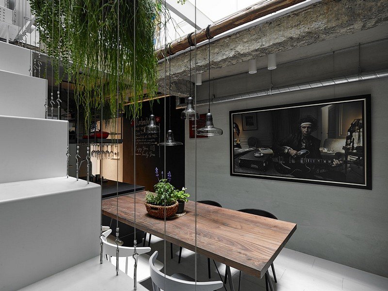
KC Design Studio focuses on both practicality and design, giving their clients the best of both worlds. Simplicity is what they do best as they feel that the design should not be too overpowering but instead make their client feel relaxed and comfortable without adding too much. Rather than using different, contrasting colours, tones are used instead. The tones they used are harmonious and complement each other well, feeding into its simplicity and minimalist design.
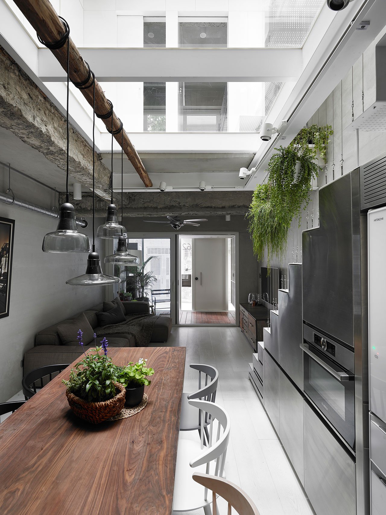
The attention to detail is quite impeccable when it comes down to the type of material they use. Rather than focusing on the furniture they bring out the feel for the space, the materials in building the space is the main attraction. Materials have the ability to make things look attractive and is yet also an element of practicality. In terms of practicality, they pay attention to ventilation, temperature, ambience, space and so on and so forth. The importance of saving space and making them look and feel big plays an important role for what KC Design Studio stands for. Liu and Tsao believe that no one should feel that the spaces are too tight. In opening up the spaces, materials are useful in that aspect.
In their inspiration from nature, they can make out geometric shapes from natural shapes and enhance the design on it. Furnishing is simple as so it does not destroy the interior space. The colours do not come across as too daring as it blends well yet stand out enough so that they are distinguishable. To add in a pop of colour, they rely on nature itself; plants. Plants not only bring pops of colours to liven up the space, they are also very good for the environment. Furthermore, they make the space more habitable and feel a bit more homey for clients living in the space so they do not feel alienated.
Summer Thornton is an interior designer based in Chicago. Her designs reflect who she is on the inside. With that said, she projects her maximalist ideas onto spaces. Her philosophy in design is to illuminate her client’s personalities through the interiors as it highlights and accentuates themselves. When they step into the room, the interior has to scream what the client is like. Nothing should be feared. Instead, she takes big, daring steps no one would to push people out of their comfort zones while keeping it true to themselves. In a sense, Thornton is pushing the limits of design within themselves.
Thornton believes in the idea of being unapologetically true to one’s self while over accessorising. This is a reminder to her clients that they should improve their well-being and be selfish for themselves once in a while. The space should inspire yet make them feel comfortable as it is an extension of themselves. Through this, she is not afraid to play with colour and pattern as it brings out the personality in a person. Colour and pattern, she expresses, should not be formulaic. Instead, it should be integrated and incorporated into the design. It all goes down from the bigger picture to the tiny details as people visiting can be intrigued and fascinated with the interiors. It is as if they will never get bored of it.
The furniture and displays Thornton uses are often timeless pieces. This means that they can be identified as pieces that will never go out of fashion but are instead beautiful forever until the end of time. She mixes the old and the new together, creating timeless interior designs. The designs should never go out of style.
The design process is intriguing. She pulls inspiration from an element of a subject. For example, Thornton focuses on the colours of the flowers instead of looking at the whole subject of nature. She makes sure she is very inclusive of the client’s personality and preferences while she helps accentuate it for them.
Model

Dining Room


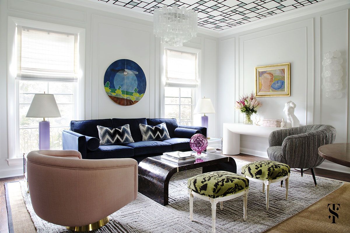
Living Room


Library


Toilet


Floor Plan

Elevations


Lighting Plan


I have produced 3 schematic drawings. These are the zonings that I did.


Overall, I would say the fourth one is the best one. I listed the pros and cons however, what really sold me was that all the rooms are quite equal to each other. This symbolises equality and that whatever the club has to offer, they will offer without any biased opinions towards someone else’s goal. Instead, we will move forward like real sisters in a house that truly cares for one another. That is what this club is for women who want to connect and help each other achieve their goals. Women need each other to show everyone we are better than what the world perceives of us. It is a dream to make that true for Malaysians as we unite despite our different ethnicities, race and background instead of putting each other down. There is also a good flow between all the rooms. The first thing people will see is the living room. People can make their way into the living room and the library to go about their day. If they need to go to the toilet, they can go from different facilities of the club. People can enjoy the view from the dining area. It gives a nice ambience. The kitchen is hidden as so the smell when cooking will not affect the overall ambience of the room.

